Of the five senses we use daily, it is that of sight that is the most developed. For reasons related in particular to our evolution, we are naturally attracted to the image, static or animated.
This fascination can trigger strong emotions and lead to increased engagement. Yet engagement is the basis ofinbound marketing.

How well can we use this human characteristic to produce compelling content for his website?
Why do we prefer visual content?
It has been established that Internet users only read 28% of the words when visiting a website ( Nielsen Norman Group study).
This skimming trend will grow with the ever-increasing volume of information available online.
The visual content allows to attract the attention of the Internet user in the blink of an eye. It should be favored for several reasons:
- It helps combat the steady decline in attention of Internet users on a site.
- The simplicity of an image or video makes them effective in delivering a message.
- When a reader is engaged by a (good) image, they are more likely to want to continue with reading written content.
- A visual sometimes helps to communicate complicated concepts in an instant way, especially with infographics.
- An image stimulates our mind more, especially if it is linked to an emotion.
How does science analyze our love of visual content?
It has been observed that 90% of the information sent to our brain is visual and that our brain responds to visual information 60,000 times faster than it does to text.
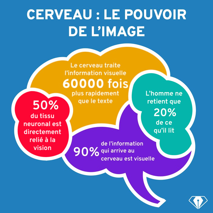
There seems to be a scientific explanation for Confucius' motto " a picture is worth a thousand words ".
In fact, our brains are able to interpret visual information and create connections between objects and concepts much faster thanks to the image.
However, this process does not happen automatically and our brains still need to put concepts into perspective.
A visual stimulation can create a visceral reaction by evoking a feeling that might be subconscious. This evocation makes any attempt at explanation difficult for anyone trying to understand the phenomenon.
Visceral reactions are the strongest forms of connection. They form in the part of the brain that guides our survival instincts, which means that these reactions are more immediate and intense than others.
The visual content should indicate the type of emotions it seeks to provoke, either through colors, subject matter or even through associations that lead to a more direct connection.

For example, this photo evokes the fullness and complicity of two travelers at the end of a day that we imagine to be filled with emotions. They each take a moment for themselves before resuming the course of their journey in the middle of nature.
What are the different types of visual content to use on a website?
There are generally 4 types of visual content :
- images (photography, quotes, memes, screenshots, GIFs, etc.)
- infographics
- the videos
- the presentations
All of these formats are appreciated but will be used differently depending on the platform and the buyer persona targeted.

It is essential to intelligently vary different types of visual content to create an engaging experience.
Why is visual marketing the star of social networks?
Social networks have relied for a long time on visuals to attract the attention of Internet users, in various forms.
According to this study by QuickSprout, two-thirds of posts on social networks are made of images. This figure will most certainly increase in the coming years, especially when it comes to videos.
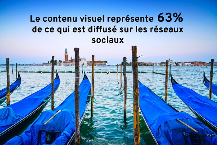
Do your publications only reach your target audience a little? The explanation is certainly above!
According to BuzzSumo, Facebook posts containing images get 2.3 times more engagement from the community.
For its part, Buffer reports that tweets containing images are clicked 18% more and produce 150% more retweets. They are also bookmarked 89% more than tweets without images.
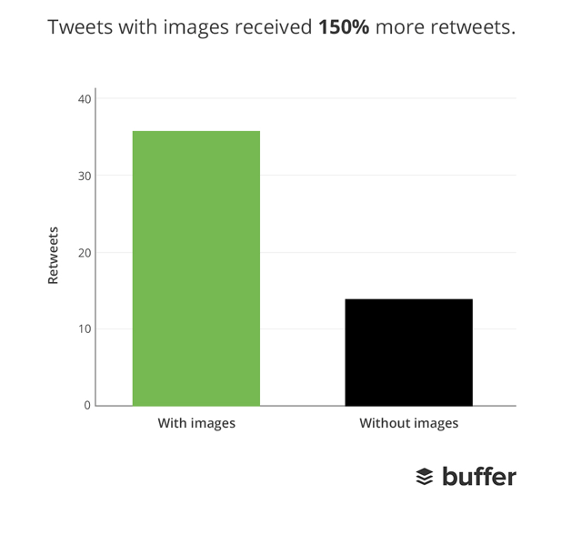
So? With or without visuals?
The power of images has led to the birth and development of new social networks relying on visuals alone (Instagram, Snapchat, Pinterest, Tumblr, etc.).
Users appreciate the ease with which they can add and share content. Brands on the other hand are sometimes less iinspired to cope with this increased demand for visuals.
How to deliver visual content that makes an impression
1 - Focus on quality
People prefer quality images (in image resolution as much as in framing or subject matter). If you don't have good enough images, you can turn to the many free image banks or, to have get a couple dozen for free, click on this image!
2 - Use visuals wisely
Visual content can be very effective in a Content Marketing strategy, but only if its use is justified in a given context. Why would you want to put a beautiful sunset image in an illustrated recipe, for example?
3 - Be consistent in your choice of colors and filters
The choice of colors in a visual is very important and this can be associated with a range of emotions. A repeated choice in a certain tone gives an overall impression, a " feeling ".
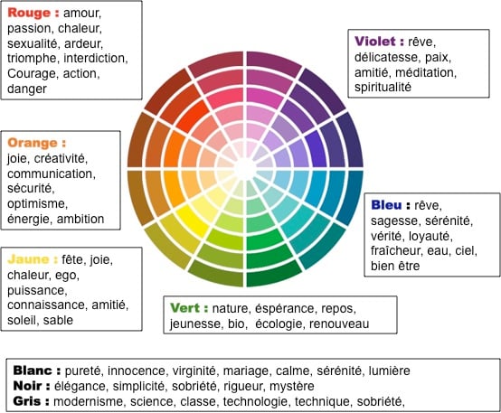
source: Communicate and spread
4 - Don't underestimate typography
Typeface is like the first visual impression of your text. Make your typography engaging enough to make the reader want to continue reading (avoid, for example, Comic Sans which gives a cheesy impression).
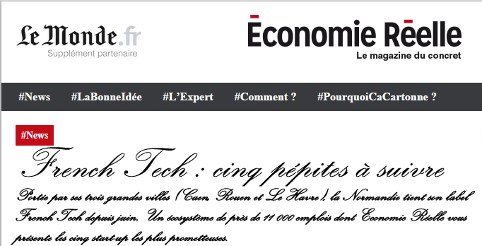
Source: e-commerce-practice.info
Typography is a crucial part of your visual content, whether it's in a publication or an infographic, it's worth looking into your choice of typography a little more.
5 - Don't neglect the text
Finally, visual content serves to boost your Content Marketing strategy but in no way compensate for poor quality content.
Find the right balance between words and images and keep the quality consistent for both aspects. Your visual content will magnify your accurate, informative and interesting text.


