What if I told you that your valuable metric measuring your site traffic is obsolete?
You'd probably say I was exaggerating, and that would be somewhat true!
Nevertheless, for many years, marketers have focused their efforts on increasing traffic losing sight of the main thing: efficiency!
The exclusive search for increasing the number of visitors does not, in truth, make much sense, as traffic remains anonymous and unqualified.
Aware of the limitation of this one metric, marketers have turned more to conversion rate optimization, developing the CRO (Conversion Rate Optimization).
The latter uses many tools to convert and qualify traffic and thus allow to put a name and an email (at a minimum) on an IP or in the cookies of a browser.
Among these tools are the now famous (or not) Call-To-Action or CTA, and Landing Pages.
Call-To-Action, the first cog in the conversion mechanism
A Call-To-Action or "Incentive to Action Button" in good French, is a clickable button that incentivizes the visitor of a web page to perform a specific action.
When the visitor clicks on this button which actually hides an internal link, the visitor is sent back to a Landing Page where they will be able to perform the desired action and nothing more.
Here are two examples of Call-to-Action :
This Super Agency Call-to-Action is done in animated gif, which helps direct the visitor's gaze.
Sympathetic, right? Effective mostly.
This CTA accurately informs the user about the action through the animation of the image and the button.
This one, designed by Netflix cleverly uses color contrast to highlight the clickable area.

A simple button can sometimes bring you many customers, many, many customers!
A CTA can be placed in many places on the website, such as in a blog post, a Home Page or even a Footer (rarer).
It can take many forms. A CTA can be in the form of an image or button as presented above or in the form of simple text as in this example from HubSpot.

HubSpot has taken the simplicity route to entice users to download their white paper.
The CTA should always specifically tell the user what action they should take. In Inbound Marketing, this action is most often to lead to a Landing Page.
The Landing page, the soft landing on your offers
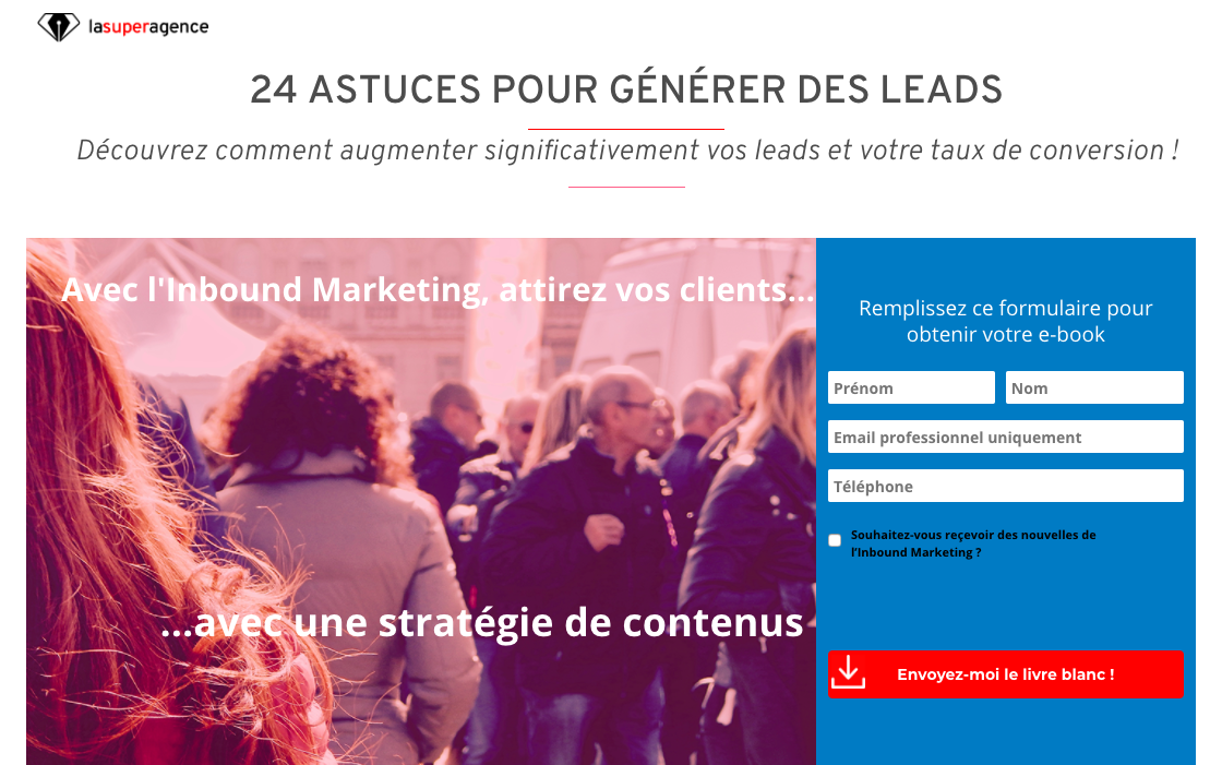
The Landing Page or page d'atterrissage in French, is a page on your website whose sole purpose is to convert the visitor into a lead.
To fulfill this objective, this page should consist of a form and additional information that encourages the user to give their information.
A Landing Page can be a contact page, a page to bring your offer to life, a request for quote or a space related to uploading content such as a white paper for example.
Here is an example of a Landing page:

A Landing Page must give confidence to the user. Its design and content must therefore be carefully designed.
To obtain a optimal conversion rate, the Call-To-Action and Landing Pages must be carefully constructed in terms of design.
There is no secret recipe for the design of these elements, but one of the techniques of CRO is to create several versions of them and measure their performance.
This technique is called A/B Testing.

Stimulating the user with a careful design of your call-to-action and landing pages guarantees you'll hit the Jackpot!
By finely observing the conversion rates achieved by varying the typography, colors, text or images of your tools, you will be able to decide the best combination.
Why are these weapons of mass conversion essential?
In addition to offering a quality experience to visitors, CTAs make it easier to reach your target audience business objectives through to the lead generation .
In fact, these buttons have a power to influence actions such as signing up for a newsletter, uploading content, making a contact, making a sale or even requesting a quote.
To be more performing and reach its objectives more easily, a company today must be able to personalize its offer and/or individualize its communication actions.
Optimal qualification of leads then becomes the best way to effectively reach its target.
Thanks to this, your website can become your most profitable acquisition channel, beating, for example, trade show attendance.
For example, let's imagine that a company exhibits in a exhibition prestigious and that 1000 visits carried out on the stand in one day make it possible to generate about a hundred contacts.
For the same investment, that is, about €25,000, a company can generate more leads through a quality content strategy that converts through optimized CTA and Landing Pages.
In fact, according to Hubspot, the leads generated through Inbound Marketing cost 61% less than traditional leads.
To put it trivially, online conversion tools are not for "looking pretty" on your site: they are essential elements of the profitability of your marketing efforts.
What are you waiting for to test these effective weapons of mass conversion!


