While an Internet user will pass, on average, only 37 seconds to read a blog post, how to make sure that the content of your career site out of the lot?
Inbound Recruiting, or Inbound Marketing applied to recruitment, is based on a content strategy diverse and qualitative. Visual supports, social network contents, audio contents (podcasts), are from excellent tools to attract your Candidate Persona.

However, it is essential to take great care with your " text " content (your blog posts in particular) as these are the only ones that will be correctly interpreted by search engine indexing tools.
Focused, well-constructed, informative content is more memorable the more its form is also mastered.
Here are our 5 tips for improving the readability, comprehensibility and impact of your written web content... and making your career blog sexy for your candidates!
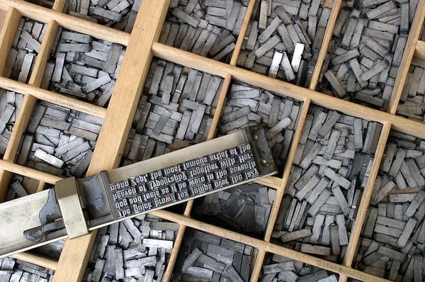
1. Am stram gram : which font to choose ?
Beyond readability, the choice of font chosen for your text (but also for your logo, website or printed materials) is not to be overlooked.
In this sense, it's important to choose a font that represents you, just like your employer brand. What image do you want to convey ? Modern, traditional, corporate, family, artistic, technical, playful?
A whole series of technical elements can influence the choice of a font : typographic point size, x-height, counterform (or counterpunch), jamb and staff, etc.
 What font should you choose for your content?
One of the key things to understand is the difference between " serif " and " unserif " fonts. " serif " or " serif " fonts are those fonts whose characters have small extensions on the ends, such as Roman Times, Courier New or Book Antiqua. " sans serif " or " sans serif " fonts such as Arial, Helvetica or Verdana do not have these extensions.
(Today you can even discover a brand new kind of font : a smart font. Google launched a new responsive and customizable typeface called Spectral in 2017 in collaboration with Production Type and Prototypo).
What type of font is most readable for your content?
This debate has raged since the 1990s. Unfortunately, it seems that there is no absolute answer.
Today, although some people think that " serif " fonts are on the way out, 61.5% of existing web pages contain text in " serif " Only on titles does this trend reverse : 51% being in " sans serif ".
So what to do ?
It would seem that in 2018 the trend for web content would be to fine and relevant combination of both font types - something that has been done brilliantly by Resoluut and Jump.
 New trend: combining two types of fonts
Minh Loïc Hoang-Xuan, Director of Strategy at Creads, advises to "break the linearity of your headlines, play with the weights, the spaces between letters and lines to make your content more impactful - and if you feel like it, why not mix different styles of typography " - be careful, however, not to prioritize aesthetics and creativity over readability !
2. Seeing the big picture : which font size to choose ?
The font size you choose also impacts the readability of your content. It's best to lean towards a font size larger than 10: 12.5px or 13.5px is a comfortable font size for most readers (as a reference, the body text of The Super Agency blog posts is 13.5px).
It should also be kept in mind that some fonts are imagined for large-scale use, making them difficult to read with a smaller font size or on smaller screens.
3. La vie en rose ? What font colors for your content
It is possible to play with colors and contrasts to highlight your text and emphasize your identity. It is best, however, to limit this practice to certain headings or a few keywords.
For relatively long written content, nothing beats dark text on a plain light background - focus on strong positive contrast.
4. Content with style
In web writing, there are certain things to respect and a certain style to adopt. It is best to adopt a write in the active voice, clear, concise, punchy, with rather short sentences.

Simple, straightforward style is more easily readable on mobile
Be sure to adapt your language by adopting simple, understandable vocabulary and avoiding technical jargon (at least without explanation !).
5. Here and there : what layout for your text
An airy text, with a short line length, structured by headings and subheadings, energized by bulleted lists - will be more easily assimilated.
In fact, while only 29% of your visitors will read your content carefully from start to finish, blocks of text will make your content more digestible and allow readers to navigate more easily, spotting the parts that interest them.
When it comes to word count, the average is at 1050 words. However, for a optimized-referencing, the recommended word count is more like 800 and 900 words - but beware, there's no point in embroidering unnecessarily for a word count !
As for line length, it's worth noting that slow readers prefer lines about 55 characters, while faster readers prefer lines of about 100 characters.

These few practices, which may seem like details to you, will help improve the quality of your content and, ultimately, the quality of your candidate leads.